Since the release of Elden Ring, its UX experience has been frequently discussed among the professionals and the players. The identified issue (based on customer feedback) is that the UI usability of Elden Ring can detract from the play experience. So I conducted this study to share with the industry about how I want to contribute to the design discussion.
Objective
How I evaluated and located Elden Ring usability issues and designed solutions to improve its user experience.
Process and Methods
Process Structure:
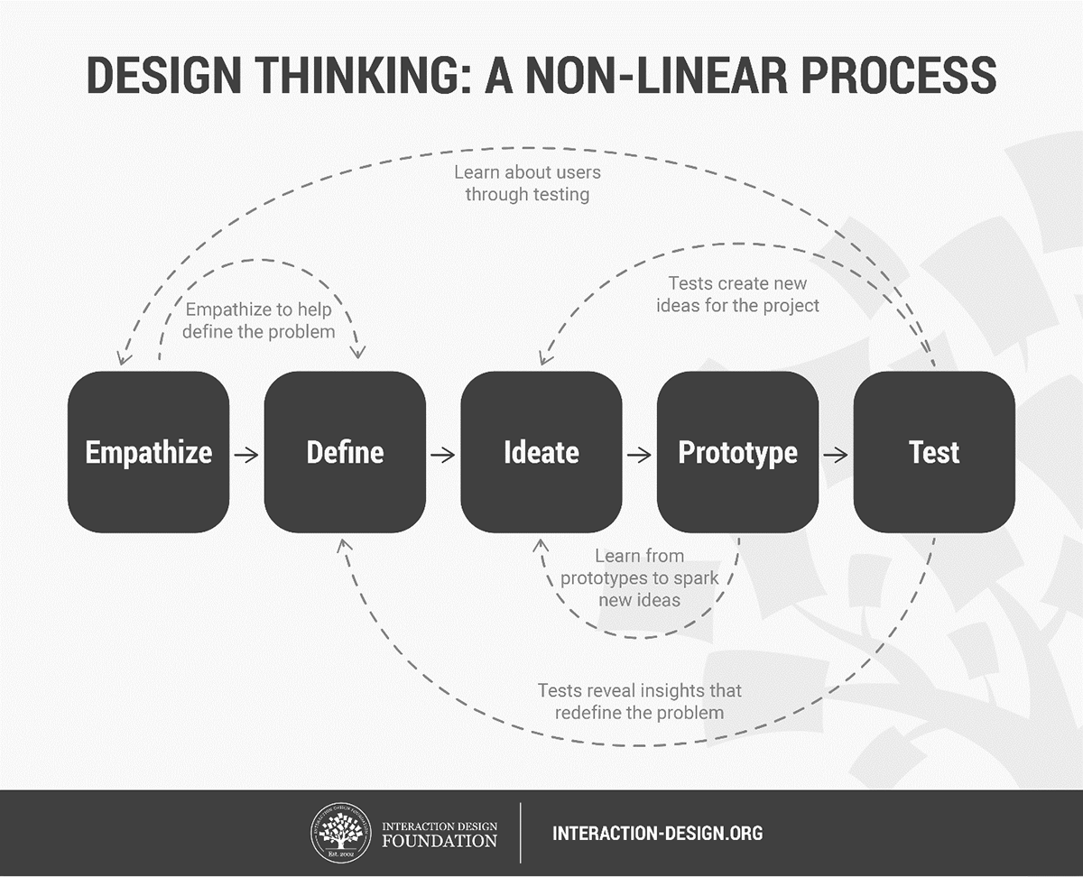
Part I: Empathize — Research Users' Needs
Part II: Define — State Users' Needs and Problems
Part III: Ideate and Prototype — Creating Solutions
Methods:
Design thinking and double diamond framework
PART I: Empathize — Research Users' Needs
a. Raw data from game stores and communities
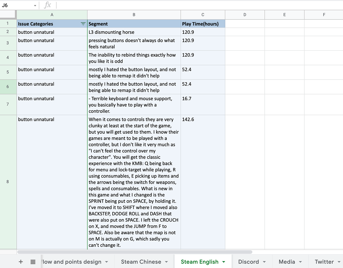
Step - 1: Use web crawler to collect raw data from steam and communities
Step - 2: Nail-down to UI usability issues (relevant words analysis)
Step - 3: Categorize issues
b. Online interviews
Sampling method: convenient sampling (hardcore players, game development students, industrial professionals)
Sample size: 10
Selecting standard: playtime > 60 hours
Questions:
1. Open-ended questions:
i. What do you think of the game?
ii. What do you like or dislike about the game?
2. Probing questions:
i: Is there anything you think can be improved?
ii: Do you have anything to say about the controls, the menu, or UI elements?
Part II: Define — State Users' Needs and Problems
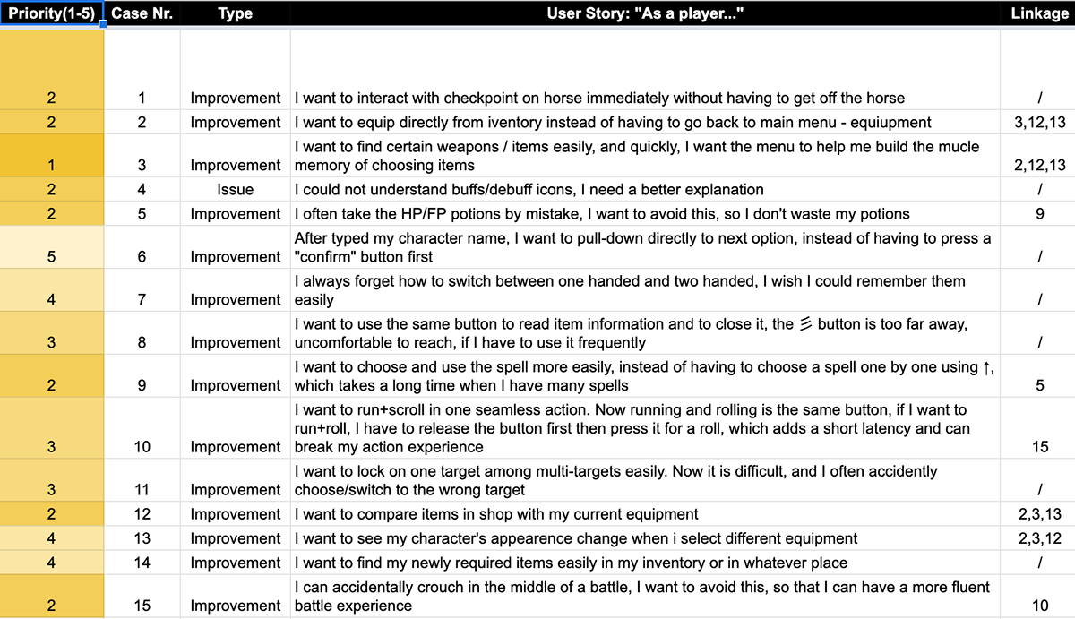
Located issues and player needs
We processed the raw data from game store reviews, communities and interviews, then organized the data into the format of user story. The following design process is based on user stories.
Data clarification
1. Some data is from my other study: Elenna Ningnan Li - Pilot Test Report: Immersion of Elden Ring, conducted in the Vehicle Simulation Lab of the University of Skövde during 2022/02/28~2022/03/25
2. 22 participants' eye tracking data, observation notes, questionnaire data, interview data are collected (Potential bias: convenient sampling, small sample size)
PART III: Ideate and Prototype — Creating Solutions
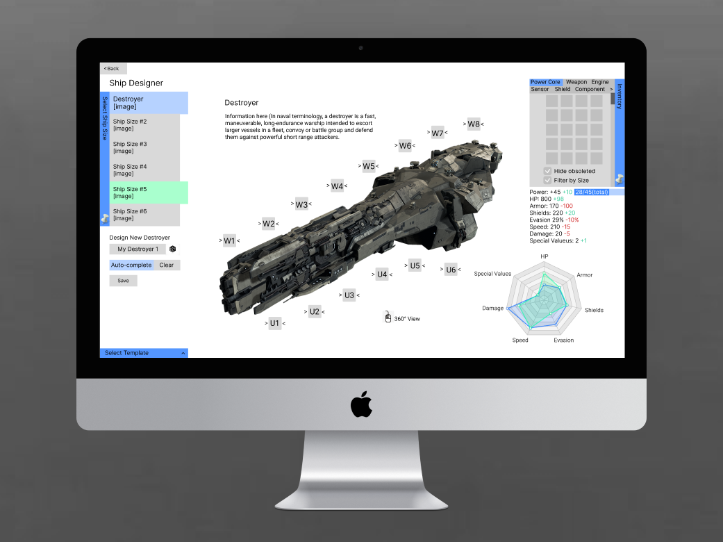
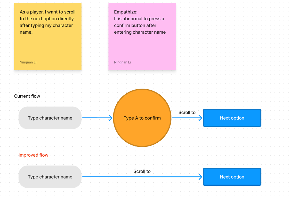
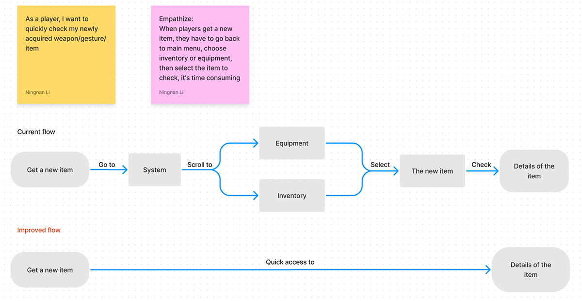
To examine the on-boarding experience of the game, we aimed to map out the players' path through the main menu the very first time they started playing the game. The important indicators taken under consideration was: amount of time spent between interactions, clarification questions asked during the Think-Aloud process, and most importantly incorrect interactions counter to the players' intent (e.g., exiting menus accidentally).
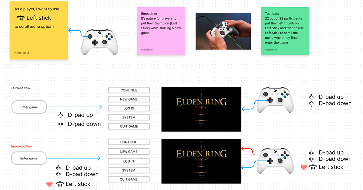
Case - 1: A more nature way to interact with menu
I created 11 design cases in total based on the user stories from PART II.
In this case, it is "As a player, I want to use [Left Stick] to scroll the menu" (see yellow sticker below).
I then broke-down the current mapping flow and added a new button to improve it (see the left corner below).
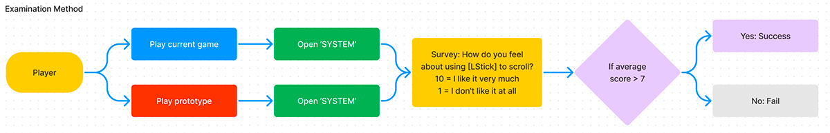
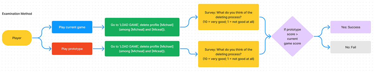
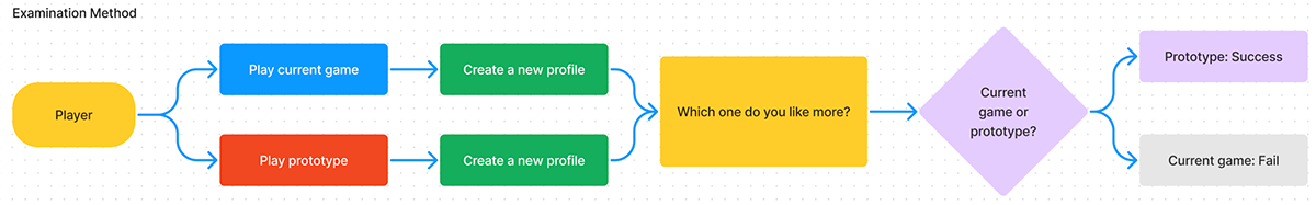
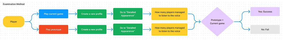
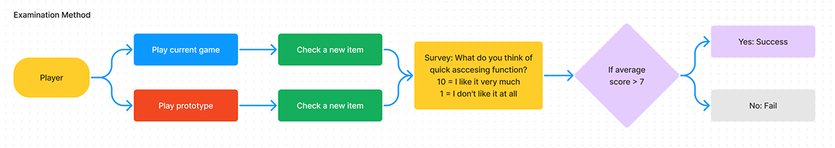
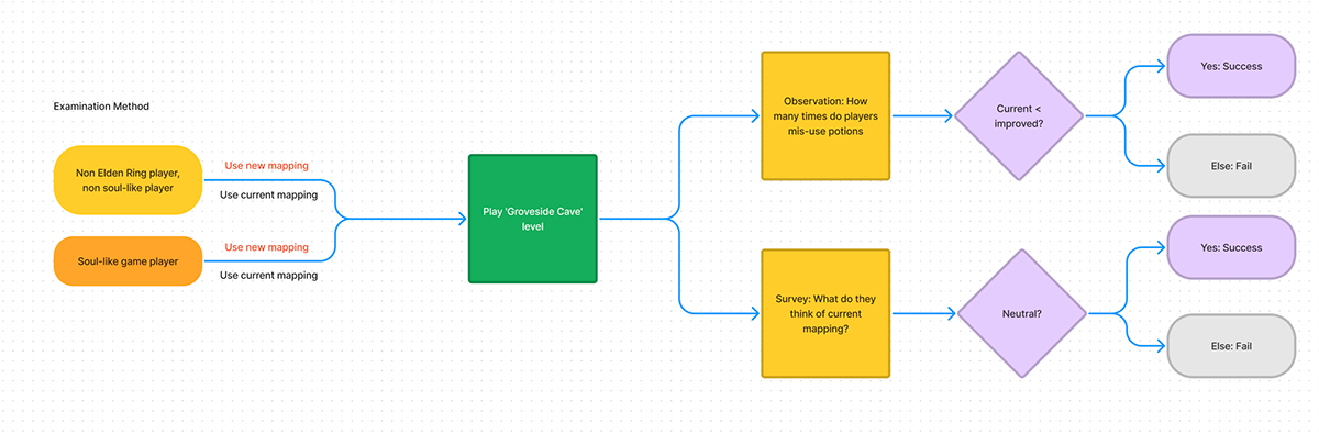
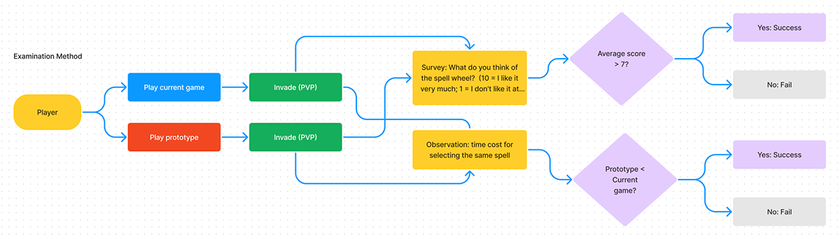
In the end, an examination method is structured to verify the valid of the design. If the average score from the survey is over 7, then the solution is a success, otherwise the solution is a failure.
You can also try it out in Figma (Feel free to write a request via email for Figma file).
Case - 2: A way to avoid deleting wrong profiles
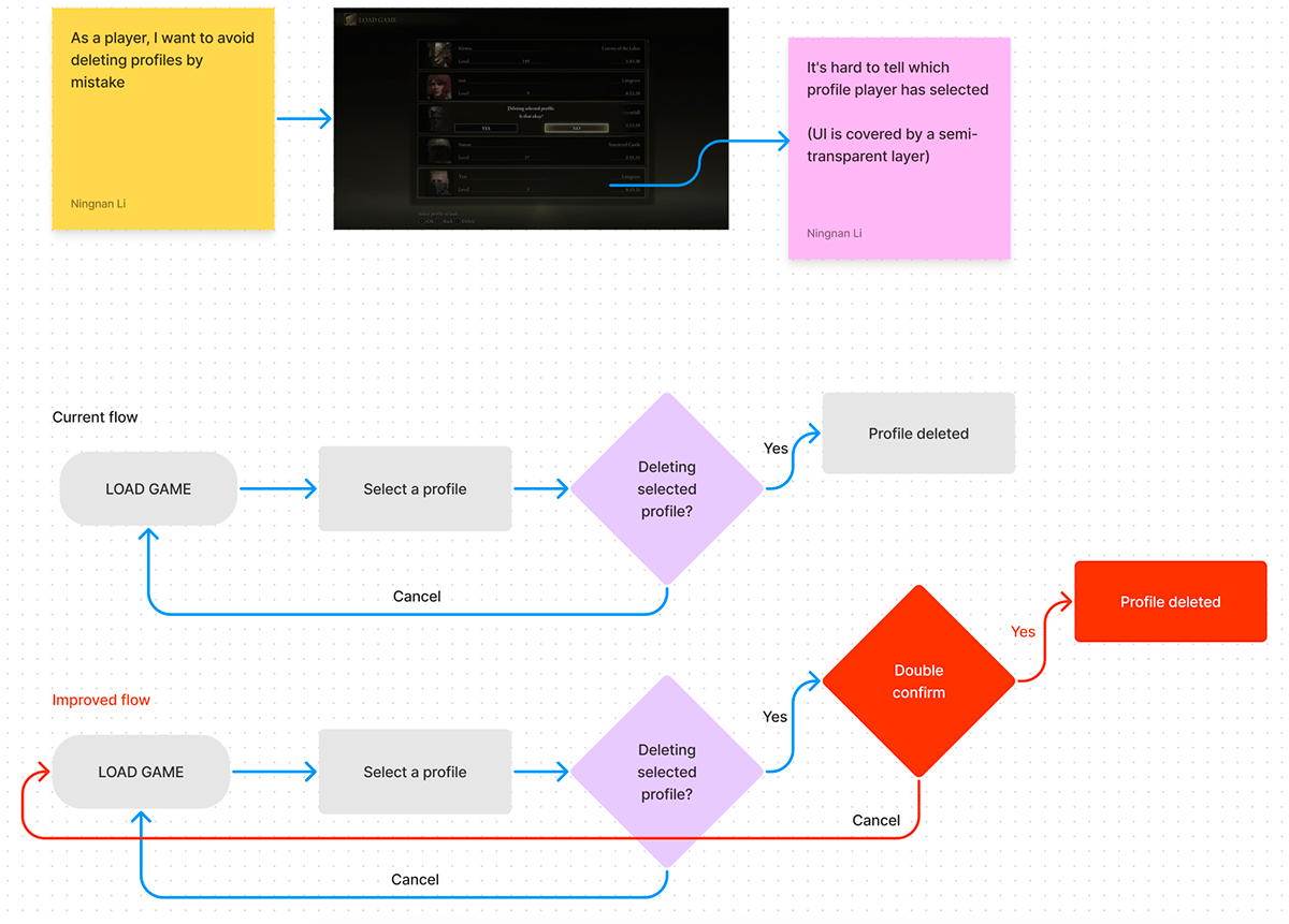
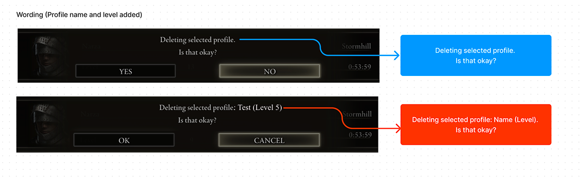
There are some other methods that are used in other games, for example some games require players to enter the profile name before deleting it. When I choose which method to go, I try not to break the previous flow too much, keep the change as small and clean as possible.
Case - 3: A conventional way to create a profile
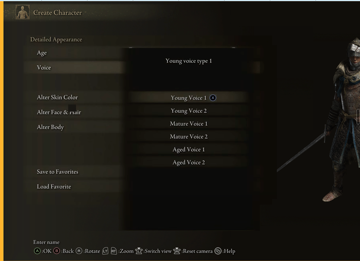
Case - 4: An improvement of listening to sample voice
Issue: 20 out of 22 players couldn't find how to listen to sample voice during playtests.
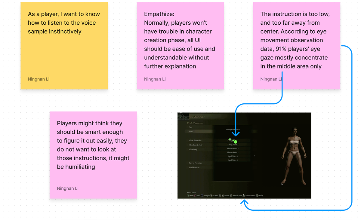
Solution:
1. Put a signal ('X' button) next to the voice type.
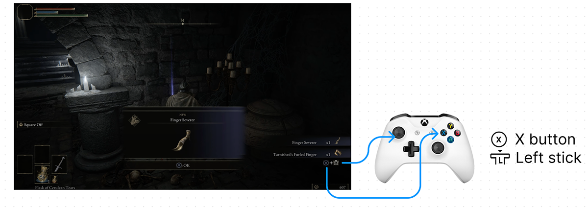
Case - 5: A quick access to item information
Case - 6: An nature mapping of two buttons
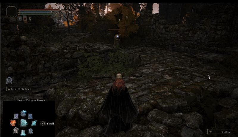
Issue: players often used potions by mistake.
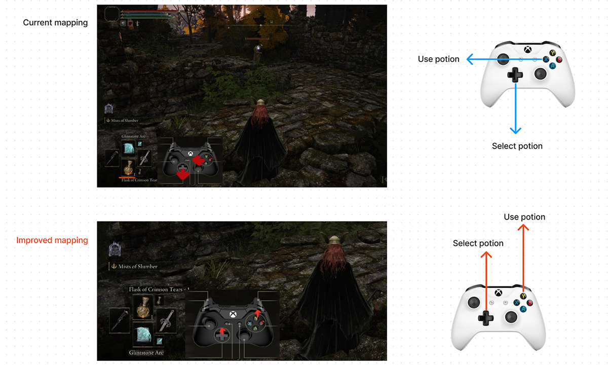
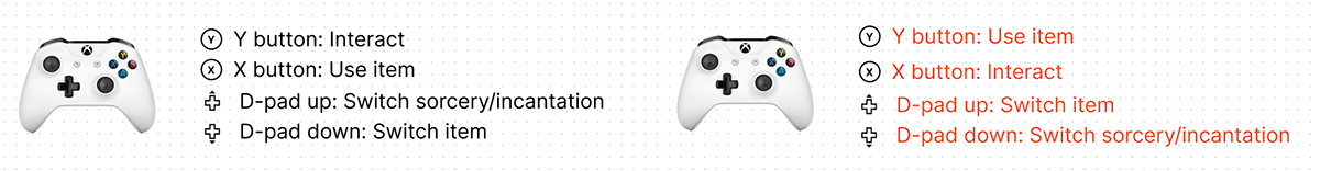
Changing of related mapping
It will be difficult for players with soul-like game experience before, to adapt the changes in the beginning, since soul games share similar button setting. Assigning participants with different tags will help better analyze the data.
Case - 7: A faster way to cast spell
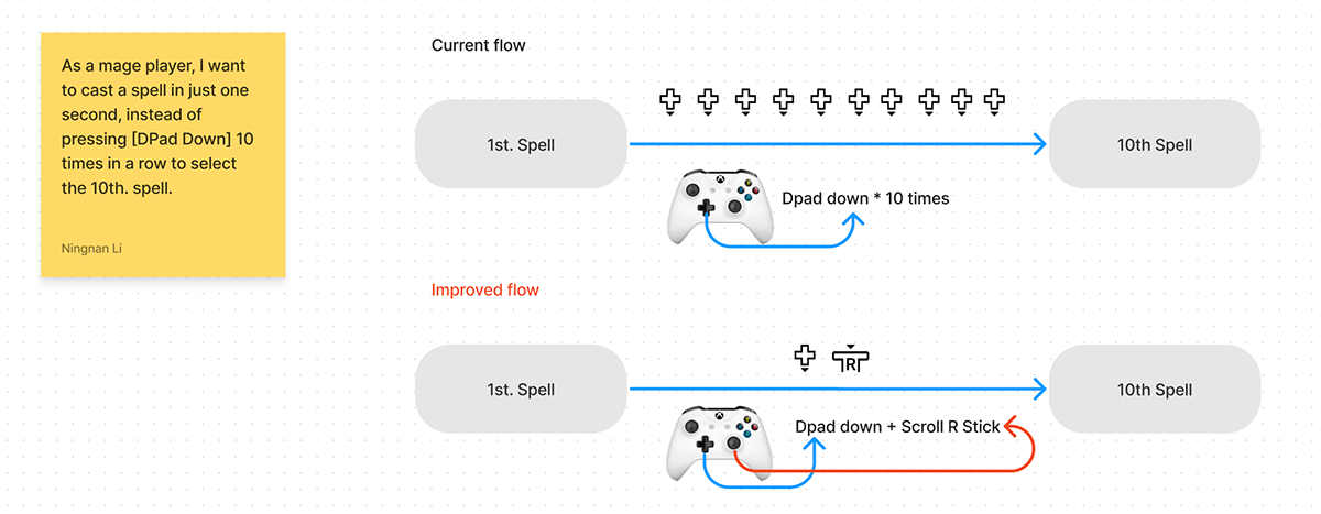
Low-fi prototype of the spell wheel
Industrial product analysis
The Witcher 3: Wild Hunt
Flaw: the UI is fullscreen mode, time will be frozen while choosing spells, which might slightly break the real-time battle flow.
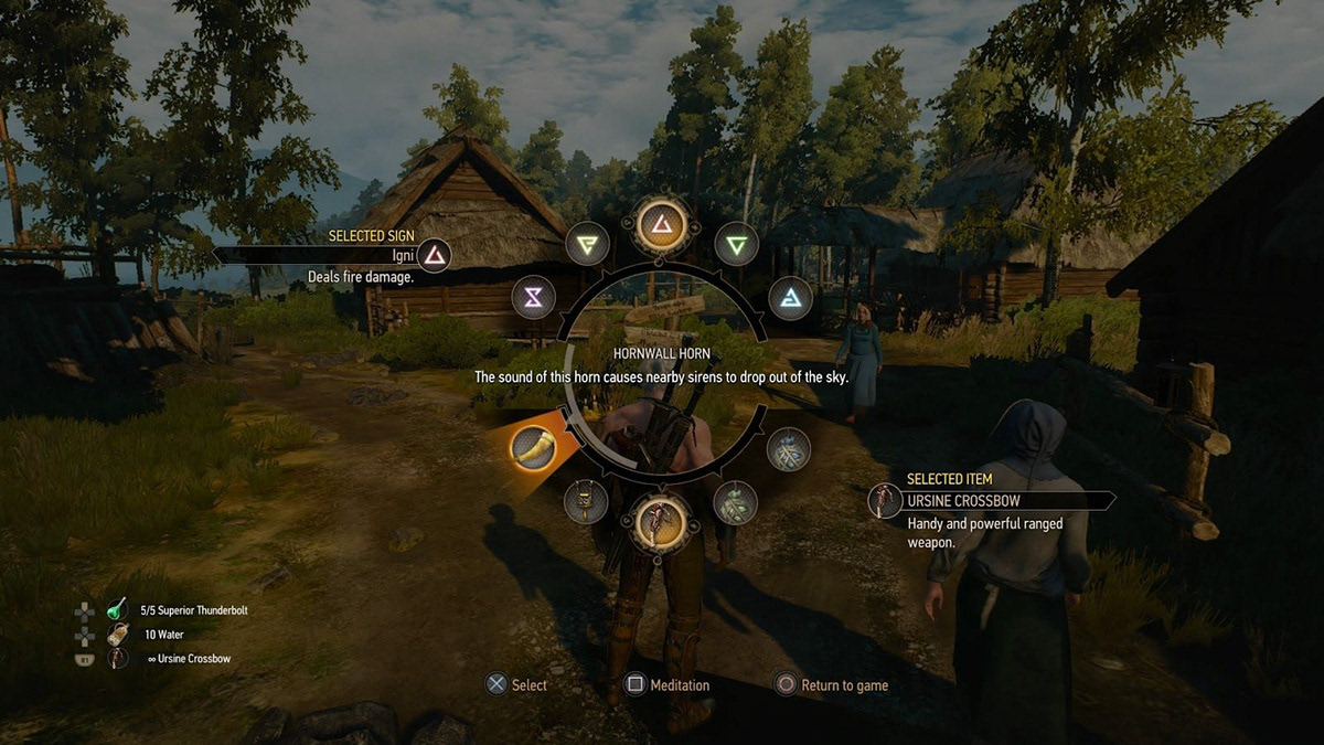
The Witcher 3 Wheel
Similar issue: the wheel might cover important visual targets in the environment
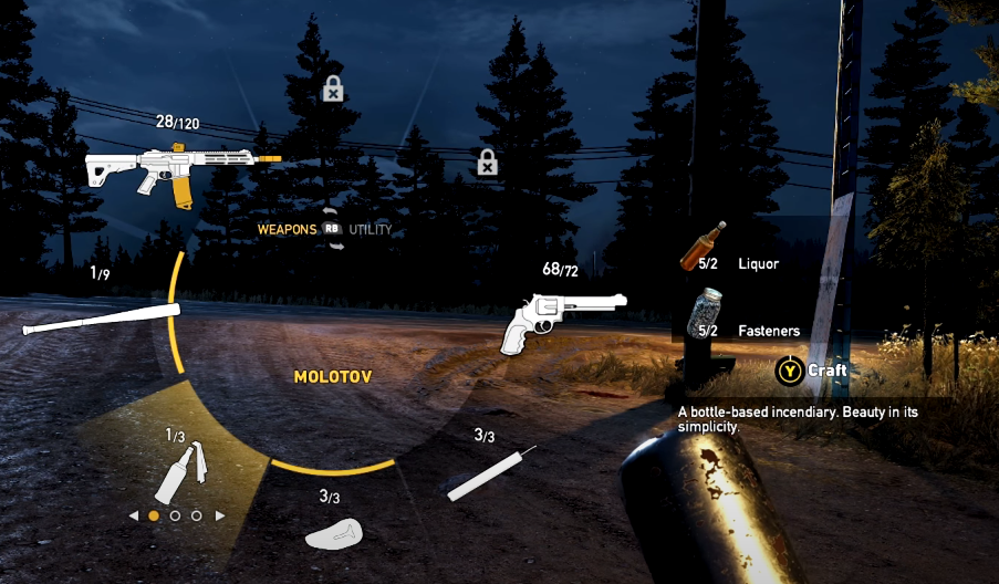
FPS Weapon Wheel
The wheel design for Elden Ring
Will only show at the original spell corner's location, will not affect the original battle flow too much
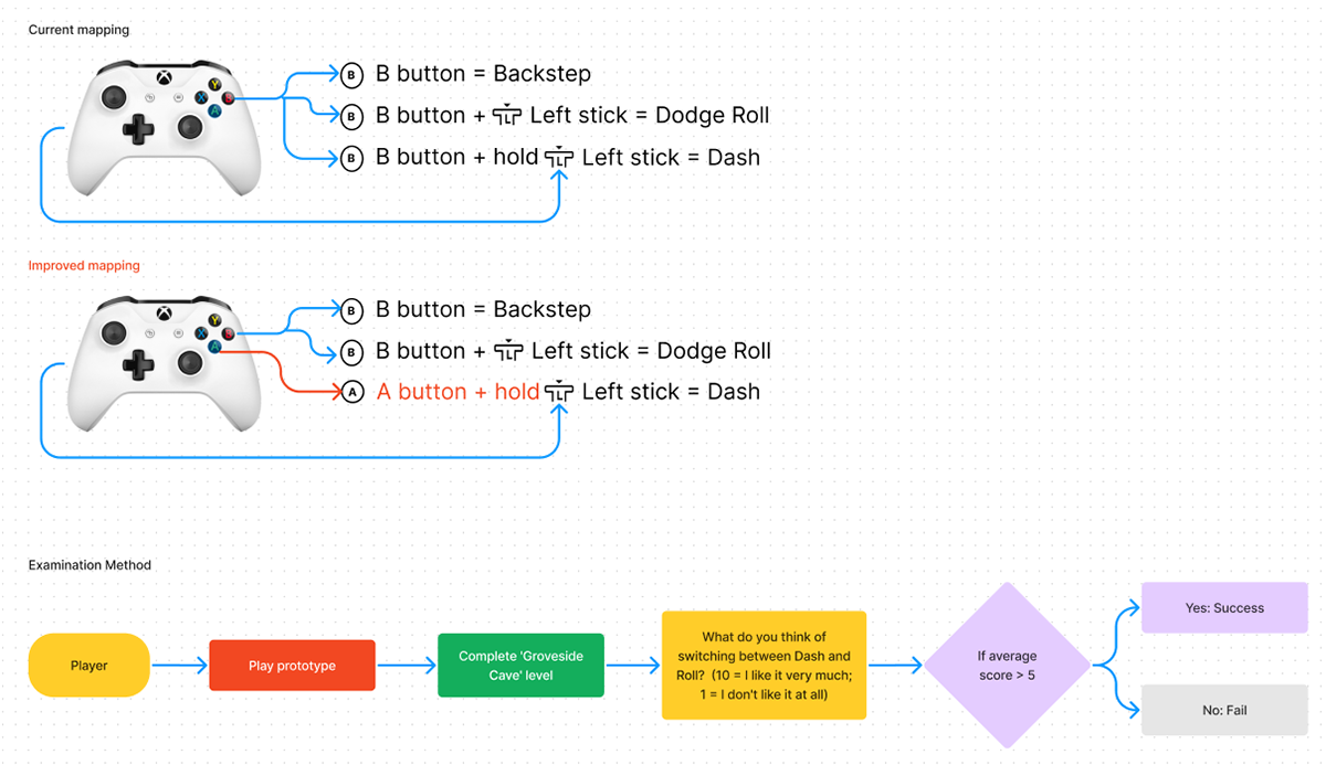
Case - 8: Reduce the burden of [B] button
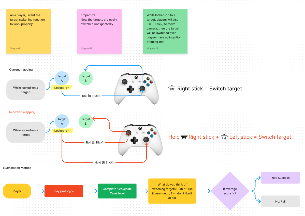
Case - 9: A reliable way to switch target
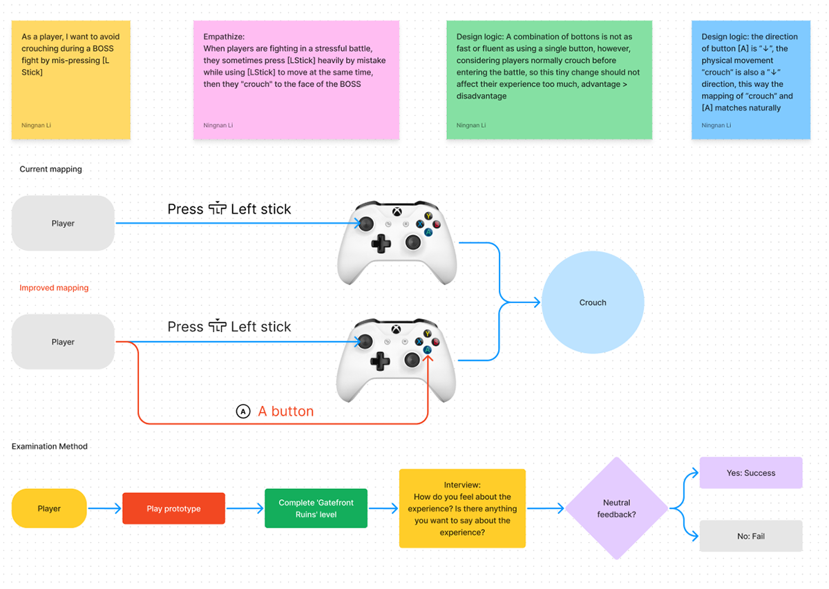
Case - 10: A way to avoid mis-crouching during BOSS fight
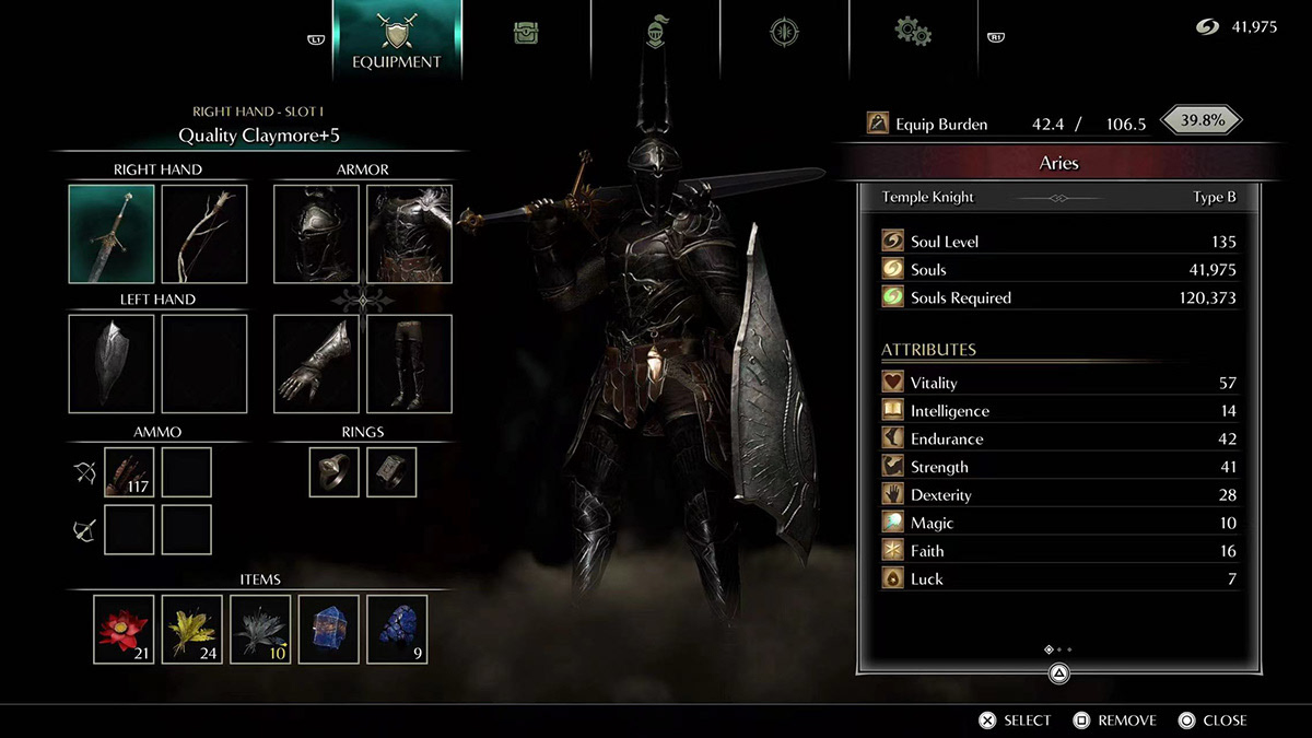
Case -11: An approach of designing an new equipment UI
Main user story: As a player, I want to find weapons and items easily, I wish the game UI can help train my muscle memory, so that the action of selecting weapons/items would be fluent.
△:
a. Each change can be examined individually by A/B testing method, combines with time tracking of different UI tasks, analysis of eye movement, user experience survey and interview.
b. This UI mockup is just a layout sample of functions, might not look very professional from art perspective
c. This design applies only to PC users, since the words will be too small for console players to read. Further design for console players is needed in the future.
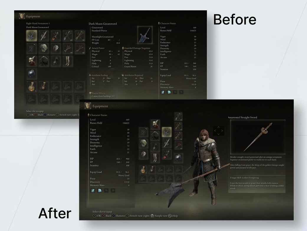
Design logic:
Nature Mapping of human body, easier to remember the location, might reduce the time of selecting body items
Industrial reference:
Demon's Souls Remake
Discussion
Designing solutions for Elden Ring was a fascinating exploration. Despite its impressive 20 million sales, I identified opportunities for improvement in its UI. I thoroughly enjoyed crafting enhanced user experiences for games, and it was exciting to realize how much impact a prototype can have. However, my initial UI design felt overcrowded when combining all elements, which highlighted the need to deepen my understanding of UI principles. Unlike tech products, game UI demands a holistic alignment with the game’s content and art style, adding layers of complexity. Moving forward, with sufficient resources, I’d love to develop a game mod to make testing more engaging and hands-on.